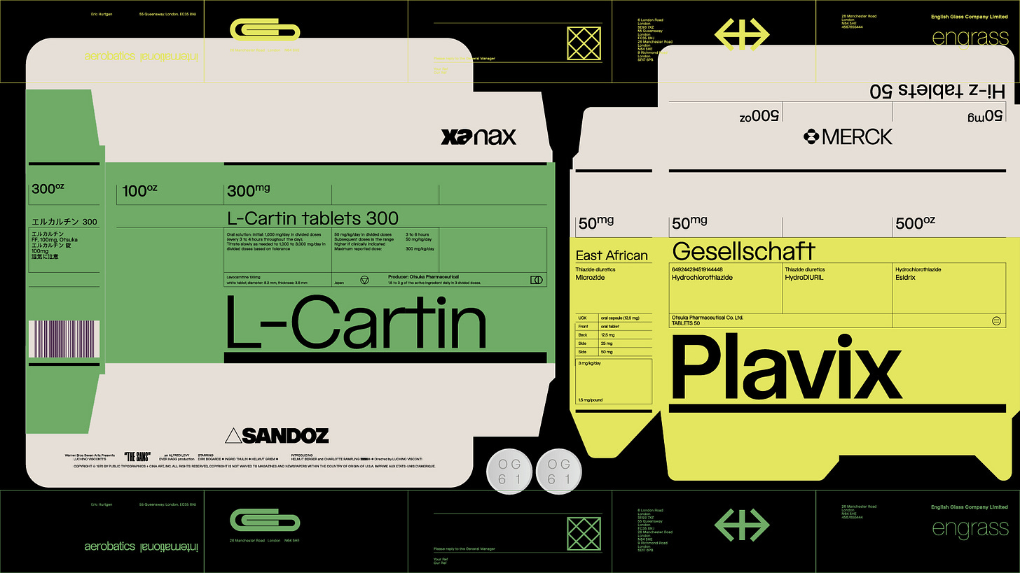
Cina Sans
My most intensive personal project to date
This week I launched a passion project of mine for the last year and a half, a typeface called Cina Sans. I am going to break down the process a little but first, I wanted to give you a few things that I have learned from type design. 1. You can't build on a broken system, you have to fix or start over. 2. Small and consistent changes add up. 3. Ship what you start. 4. If it’s challenging, it’s probably right. 5. Each stage of the project is a new project
Designing Cina Sans was a year-and-a-half journey to create a typeface that was neutral yet distinctly mine. I designed Cina Sans to be adaptable and multifunctional, catering to my needs as a designer while offering something unique to others.
Instead of relying on historical references, I focused on defining each letter according to how I wanted it to look and perform. This process involved rigorous testing, iterations, and refining until the letters aligned with my vision. I had tried to draw a neo-grot sans three times before, and it never worked out because there was no emotional connection.
The journey was not without challenges. Aiming for the 'perfect sans' was an abstract goal; without strict boundaries, the design process sometimes felt overwhelming. The initial idea for Cina Sans came together quickly, but the refinement process took over a year. Testing the font with friends validated the work, as their enthusiasm and immediate use of the typeface motivated me.
Cina Sans is designed to be highly versatile, suitable for everything from text setting to display and branding. It performs exceptionally well in digital contexts, and I've created numerous stylistic sets to enhance this versatility. With 18 stylistic sets and a massive array of symbols, Cina Sans offers a toolkit of typefaces within one system, ready for customization. I see this font as a design system that both new and experienced designers can use to create great designs.
As for the future, I'm excited about potential expansions, including italic versions and possibly condensed or extended weights. With Cina Sans, the possibilities are many, and I can’t wait to see how it evolves in the hands of other designers.
More here and thanks for reading. > publictype.us


A big congratulation!
Amazing! Can't wait to see the family grow over the next year's