

Most people meet a typeface at the end of the process. It’s already named, packaged, and ready to use. When it all comes to an end, making a typeface is a long and rigorous process and something I do for fun and to relax. Ghostly Gothic started years ago as a custom typeface to help bring a new phase to Ghostly International’s brand.

At the beginning of a project, anything is possible. I knew I wanted something rooted in early grotesques and copperplates. It needed to feel sturdy, fashionable, timeless, and not cold. The first stage is usually just to see if what I’m thinking is viable, set in a word or five. Once I get that drawn out, I can start to see the inconsistencies and issues within the structure. If it’s decent and seems to work, I keep going on.

The middle phase is where a typeface either comes together or all falls apart. I refine, refine, and then refine. I first draw a full character set, then redraw, test, and do it all again. This part is tedious, but it’s where the personality and quality develops. I’m working to make sure every letter finds its voice, that rhythm and spacing feel consistent, and that nothing unintentionally stands out. I get lost in whitespace, proportions, the way letters play together. Eventually I am building a system, not just a set of letters anymore. That’s when things like the unicase mode, iconography, and stylistic alternates work their way in. Normally this takes me about a year of somewhat regular work when I have time.
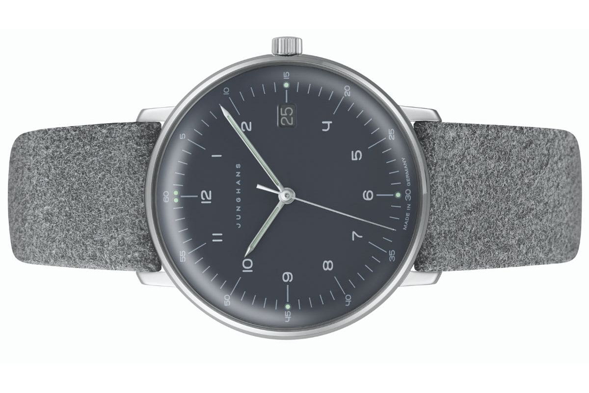
The lighter weight for Ghostly Gothic came years later. I had always planned to draw it, but what pushed me was seeing Max Bill’s watch numerals. I kept coming back to how thin and funky they were. They felt stripped back but never weak. That got me drawing again.
At the end of a project, I polish and look for anything that’s still off and make sure the full system holds together. Is anything off in tone? Is anything missing? I ask myself, why did I draw all these letters? Maybe I will draw a black weight? I document everything, prep it for others to use, do the showings, and then let it go. This part always feels like starting over again as it’s an entirely different mental mode.

Ghostly Gothic now has five weights and supports Latin, some Greek, and Cyrillic. It’s a typeface built from legacy and made to carry ideas quietly but clearly. More at www.publictype.us
Links: Cina Associates, Cina Art, Public Type
I will always keep my substack free. Support via likes, subs, reposts, comments, buying some of my art, typefaces, etc.
Perfection
🤩 fan for life