The Herb Process
A breakdown of how I make the Herb artwork
Herb Sundays is a playlist series that I've been designing for Sam Valenti IV, the label boss of Ghostly International, for several years. The project revolves around embracing the concept of being uncool, a 'herb.' Herb is a term that was once used as a diss in hip-hop, originating from the failed Burger King campaign “Where’s Herb?” by the J. Walter Thompson agency. This campaign spent a whopping 100 million dollars (in today's money) basically to invite people to search for a 'nerd' in their store for a 5g prize.
Using Herb in this context, refers to those who indulge in guilty sonic pleasures while enjoying their Sundays off. Sam invites top music industry and tastemakers in the arts to create their Sunday mix “for when no one is looking.” Sam has me do the artwork with no brief, restrictions, etc.
For the first season, I followed a templated system, but in the subsequent seasons, I decided to open up a bit more.
I've received numerous requests to share my art-making process, so here it is. It all begins with an email from Sam by Tuesday evening, providing me with the artist's name, mix, and sometimes relevant info about them. By Wednesday, I start processing the email, and I usually begin the actual work by Thursday, sometimes extending to Friday if I'm busy.
Herb serves as my creative playground where I can play with new and old ideas, styles, and techniques. I strive to complete these designs in under one hour, pushing myself to find the best and most efficient paths. I try to draw inspiration from the featured artist, incorporating cues from the mix or creating my own unique aesthetic. The only restriction is primarily using typefaces from my foundry, publictype.us. Once I have a promising outcome or if I've spent too much time, I share a folder of ideas with Sam for the final selection.
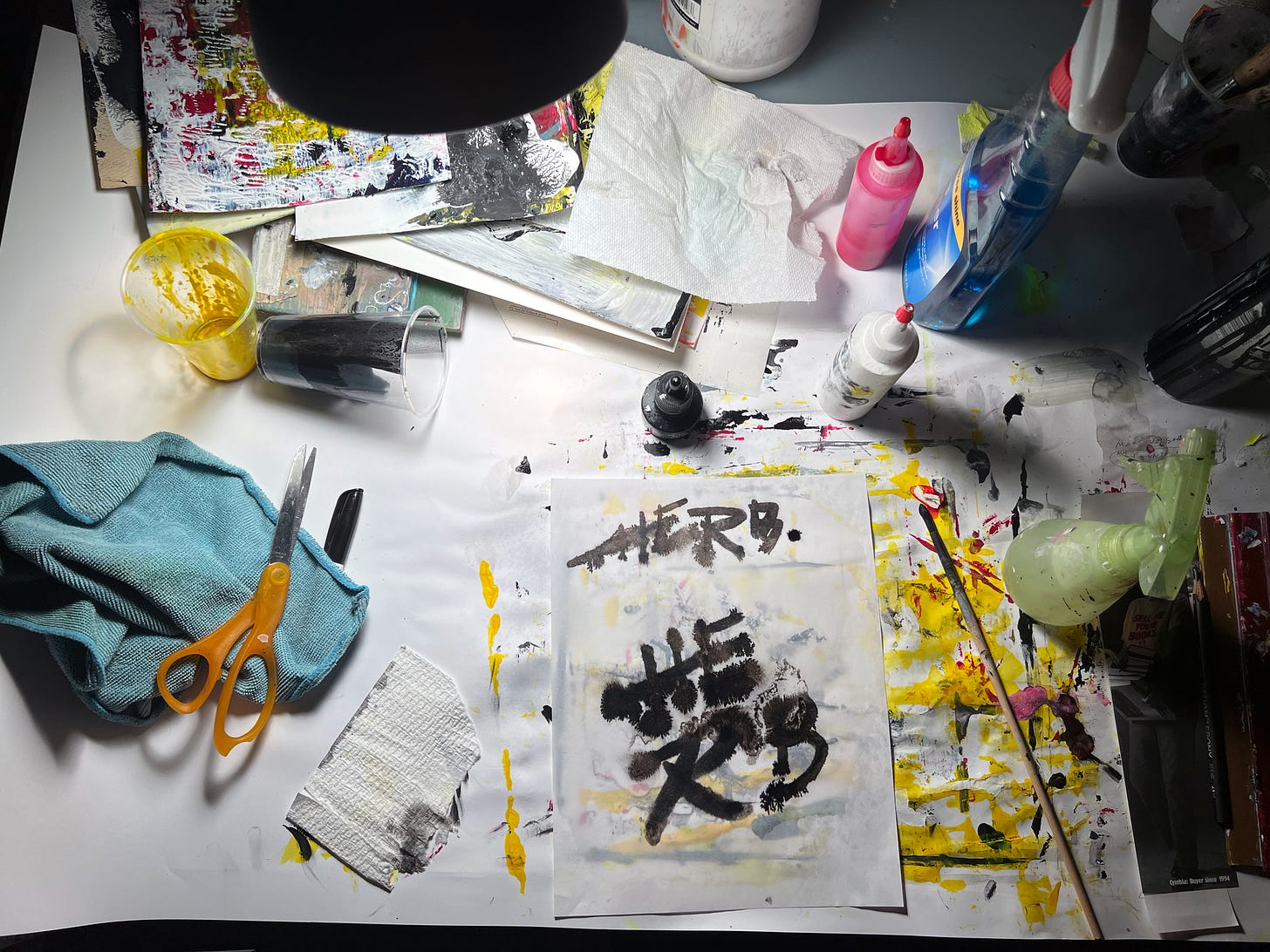
For this week's Herb, I took a different approach. Abe Burmeister’s wide-range playlist inspired me to focus on type design. One night, as I was falling asleep, I got an idea to experiment with pen and ink typography so I got up and started sketching. I used ink and paper and did four sketches.
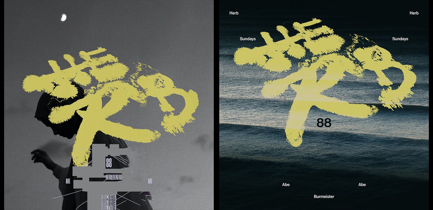
I was impatient so I took a cellphone shot of the type as it was drying and brought it into Photoshop. I played around with different background images and angles for about 30 min, but nothing seemed to work, so I decided to sleep on it.
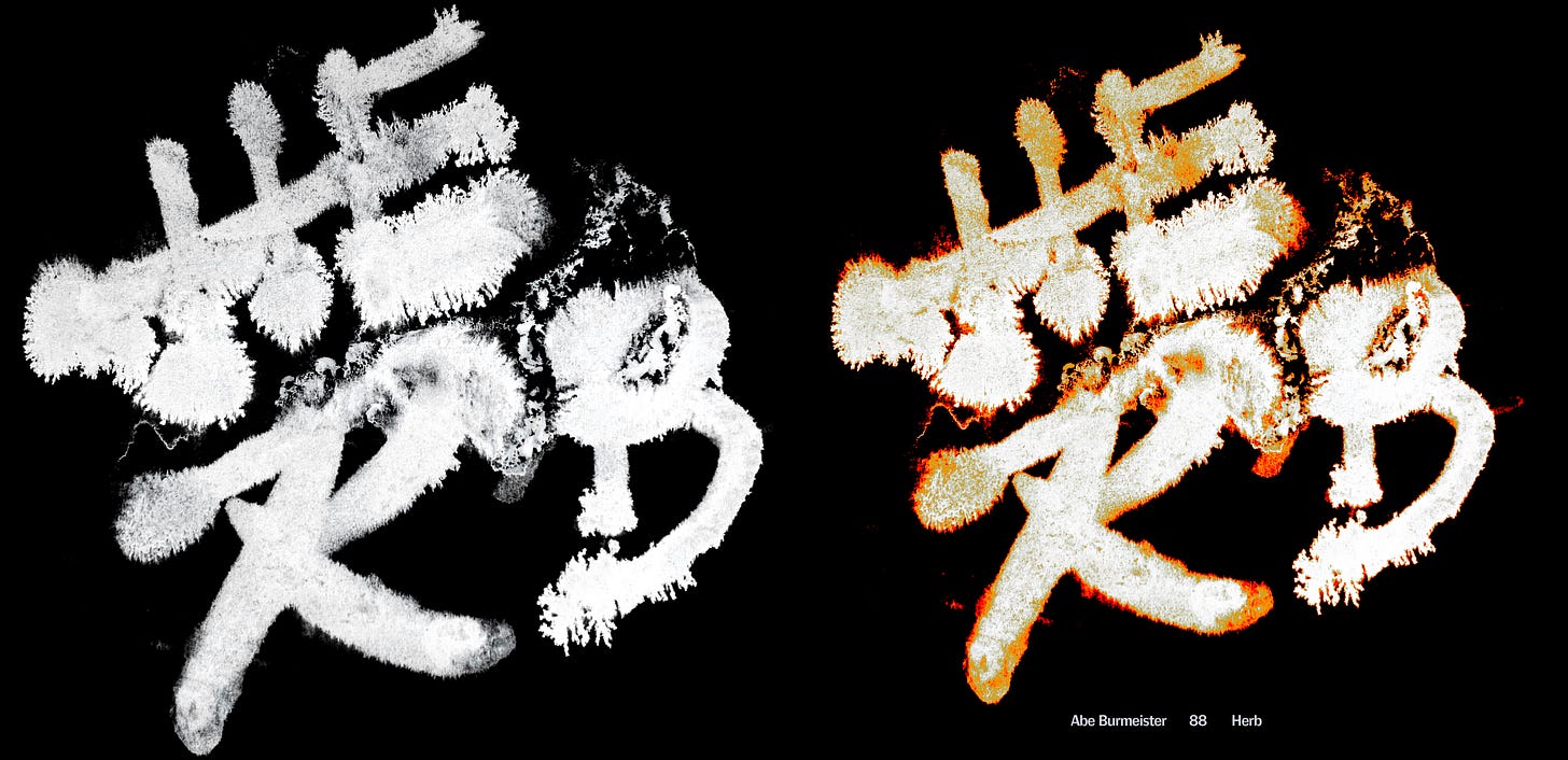
The next day, with fresh eyes, I saw that the lettering should be the main focus. I made some color adjustments, and that's how the final design came to be. One of the things I have noticed is when the image is the hero, I back off on the supplementary type.
In the end, it’s about being curious and being open to trying new things. Let me know if you have any questions or want to see some more behind the scenes work and I will do my best. I have a lot of unseen work and would be fun to show some of it.
_
Links: Cina Associates, Cina Art, Public Type


I will never say no to your behind the scenes / process articles.
I cannot do art without exploring the philosophy behind it. I see you are the same. Thanks for the interesting explanation of your process.